
Why Website Navigation Matters More Than Most Business Owners Realize
Your website navigation is the roadmap for your visitors. When navigation is clear and simple, people find what they need faster, stay longer, and are more likely to contact you or make a purchase.
When navigation is confusing or crowded, visitors get frustrated and leave. Not because your business is not good, but because your website makes it hard to find what they need.
Whether you are launching a new site or improving an existing one, navigation directly affects user experience and conversion results.
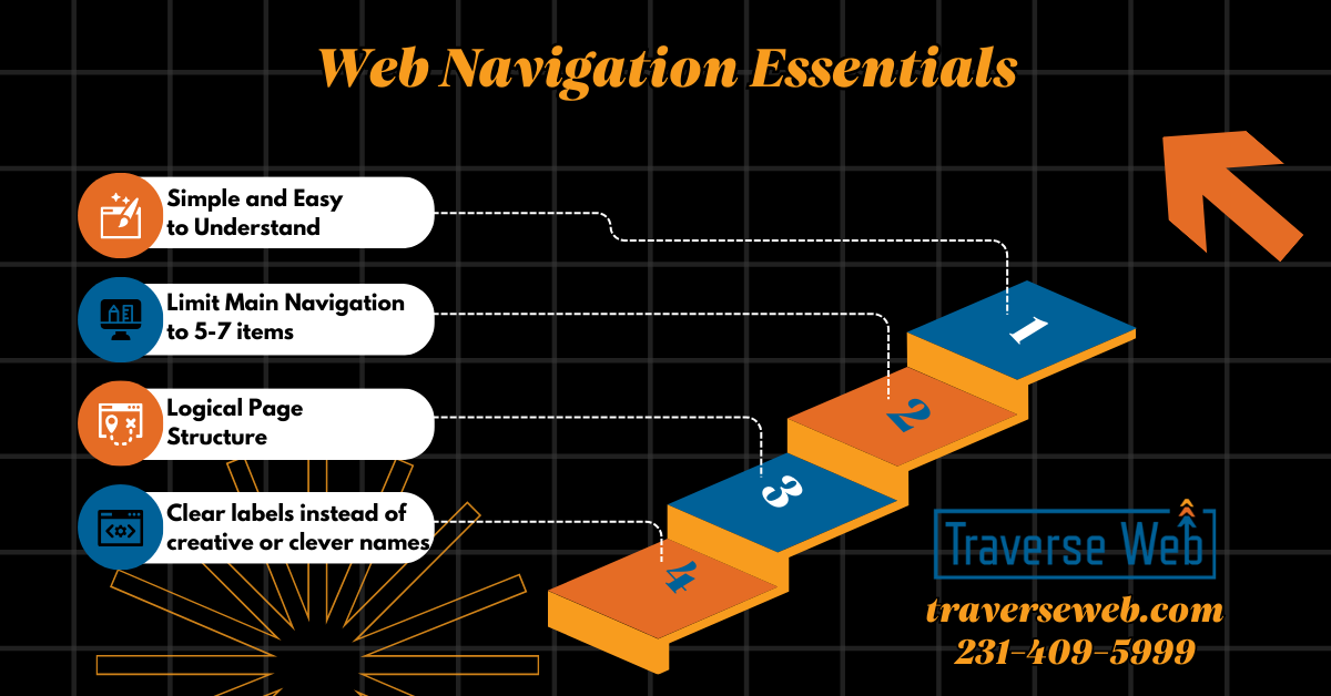
Keep Navigation Simple and Easy to Understand
When it comes to navigation, simple almost always works better. Visitors should know where to click without thinking about it. If menus feel crowded or complicated, users often leave before exploring the site.
Best Practices for Simple Navigation
- Limit your main menu to about five to seven main items.
- Use clear labels instead of creative or clever names.
- Group related pages together logically.
Clarity almost always beats creativity in navigation menus.
Prioritize the Pages That Support Your Business Goals
Your navigation menu should reflect what matters most for your business. If a visitor only clicks one menu item, it should move them closer to becoming a customer.
How to Prioritize Navigation Links
- Place high value pages where visitors look first.
- Make service pages easy to find.
- Include a visible call to action such as Request a Quote or Book a Consultation.
Use a Logical Page Structure
When pages are organized logically, visitors feel more comfortable exploring your site.
Navigation Structure Tips
- Organize pages from general topics to specific topics.
- Keep important pages within two clicks of the homepage.
- Avoid hiding important pages deep inside menus.
When navigation feels predictable, it builds trust.
Make Mobile Navigation Easy to Use
More than half of website visitors now come from mobile devices. Navigation must work just as well on a phone as it does on a desktop computer. If visitors struggle to tap links or find menus, they often leave quickly.
Mobile Navigation Best Practices
- Make menu icons easy to see.
- Make links easy to tap.
- Limit layers of sub menus.
- Test navigation regularly on real phones.
Consider Sticky Navigation
Sticky navigation keeps the menu visible while users scroll down the page. This makes it easier for visitors to move around your site and find important pages without scrolling back to the top. Sticky navigation often improves usability and helps keep calls to action visible.
Help Visitors Know Where They Are
Small visual cues help visitors stay oriented on your website.
Helpful Navigation Features
- Highlight the page visitors are currently viewing.
- Use breadcrumb navigation for larger sites.
- Make it easy to move back to main sections.
When visitors know where they are, they are more likely to continue exploring.
Make Navigation Accessible for Everyone
Accessible navigation is good for users and good for search visibility.
Accessibility Basics
- Use strong color contrast.
- Make menus usable with a keyboard.
- Use clear descriptions for icons and images.
Accessibility helps you reach more potential customers.
Add Search for Content Heavy Websites
If your website has many pages or blog posts, search functionality becomes important.
Some visitors prefer searching instead of browsing menus. Place search where visitors expect to find it and make sure results are accurate and organized.
Use Data to Improve Navigation Over Time
Navigation is not something you set once and forget.
Use analytics to understand:
- Which pages get the most clicks
- Where visitors leave
- How mobile navigation compares to desktop
Real user testing can also reveal issues you might miss.
Navigation Should Always Support Conversion
Every navigation decision should support your main goal, whether that is getting leads, bookings, or sales.
Conversion Focused Navigation Tips
- Include call to action buttons in the header.
- Use colors that help important links stand out.
- Make contact and purchase options easy to find from every page.
Bringing It All Together
Good navigation creates a better experience for visitors and supports your business goals at the same time. Simple menus, clear page structure, strong mobile usability, and ongoing improvements help guide visitors toward taking action. If your navigation feels confusing or cluttered, improving it can make a significant difference in how your website performs.
If You Would Rather Have Navigation Designed to Support Real Business Goals
Many business owners add pages over time and navigation slowly becomes crowded or confusing. It happens more often than people think.
Clear navigation requires planning, structure, and understanding how customers move through a website.
If you would rather focus on running your business instead of reorganizing menus this is where Traverse Web helps. We design, build, and host websites with clear structure, strong usability, and conversion focused navigation built in from the start.
Our goal is simple. We want your website to feel easy for customers to use and easy for you to manage. Email us at updates@traverseweb.com or call us at 231-409-5999.